Stealing Fuel Data
By Dave Allie
Published Apr 19, 2019 • 12 min read
Published Apr 19, 2019 • 12 min read
A little over a year ago, I discovered that the ACCC (Australian Competitor and Consumer Commission)
reports on fuel costs in the major cities of
Australia.
I was pretty interested in what kind of insights could be pulled out of the historical data, however, I ran into a few
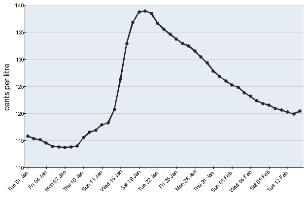
speed bumps when attempting to get the raw cost data. The ACCC doesn’t present the raw costs, instead, they have an
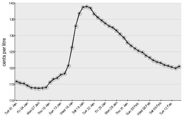
image of a graph containing the cost of fuel over the last 45 days for each city. Each day the image is updated, the
oldest data point is removed, and a new data point appears.

Frustratingly, the raw values aren’t included anywhere on the page, and after coming up empty-handed, I decided to try
a different avenue. Below each image was “Source: FUELtrac”. A quick search took me to their website where they
advertise a range of reports, including, fuel prices for Australia. As far as I could tell, the only way to get reports
from FUELtrac was entering your details, starting a commercial process, and purchasing the report. Being a side project,
I wasn’t really interested in spending money to get fuel data.
At this point it became a bit of a challenge to get the fuel prices for free, the man be damned.
There are a few sites around like Petrol Spy which reports fuel prices,
but does the exact same thing as the ACCC. It presents pre-rendered graphs and doesn’t expose the underlying data
anywhere. Things started to look pretty grim, the people paying for these reports or manually collecting data weren’t
just going to give it away.
I went back to the ACCC images and took a closer look.
It turns out, every single image has the exact same dimensions and the exact same amount of whitespace around the actual
chart. The perfect kind of image for a scripted analyse and data extraction process. However, each image still only had
45 days of data, and to build a decent data set a lot more than 45 days of data was going to be required. I needed the
ACCC images over a range of time. Again, the ACCC didn’t seem to want to grant easy access to their images, the
historical images were impossible to find, and the main images shown for each city had generic URLs:
https://www.accc.gov.au/sites/default/files/fuelwatch/brisbane-ulp.png With the underlying image being updated daily.
So I built a small lambda to download that image each day and save it into an S3 bucket
(source here) and promptly
forgot about the whole thing. That was over a year ago.
I picked up this project a week or two ago, coming back to over 500 days of data, determined to get the raw data from
the image. I used OpenCV and Python, and have linked the source code at the bottom of the post.
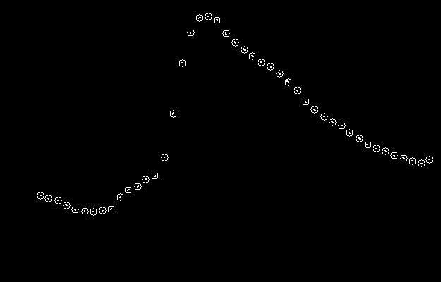
To start, I wanted to determine the pixel position of each dot on the graph in relation to the top left of the image.
Thanks to the visual difference of the dots on the line graph, using a bit of image manipulation, it is possible to get
the individual positions of the dots.
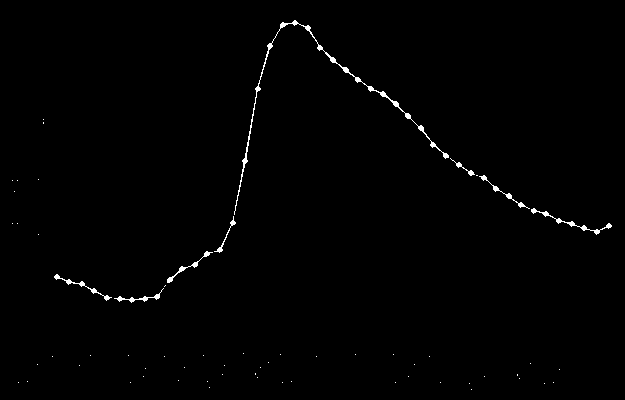
Grayscaling the image and applying a threshold converts every single pixel to either black or white, removing all the
extra noise of the background colour of the graph and the axis. In this case, I chose to threshold exactly halfway
between black and white. So if the pixel was more black than white, it would be converted to completely black, and the
rest were converted to completely white. In order to make future transformations easier, the image was also inverted,
I’ll explain why in a bit.
From here, the image was eroded. This can be imagined as shrinking the areas with white pixels and growing the areas
with black pixels. The idea of this step is to end with an image containing just the dots from the graph and nothing
else. If too much is eroded, the image will be completely black, if not enough is eroded, there will be white pixels
that aren’t part of the dots. This is why it’s important to invert the image, if it hadn’t been inverted, the graph
lines would have become larger when eroding.


An erosion amount of 4 was found to be perfect, we’re left with a black image
with a small cluster of white pixels where the dots were on the original image’s graph. For the next step, it is
important that dots are not connected. So while an erosion amount of 2 did get rid of most of the axis, most of the dots
are still connected by a thin white line.
Next, the image was analysed for contours. This process attempt to build and return paths around borders of shapes.
Seeing as the only non-black pixels are our dots, we’re returned a list of borders that make up each dot. From there,
it’s one line of code to get the locations of the centres of those shapes. Plotting the centres on both the eroded
image, and the original, we can be sure that all the points were found, and no random clusters of pixels were
incorrectly identified as a point.
Now that we can accurately identify points from the graph in the image and their position within the image, we need to
turn those values into a fuel cost for each day. I cut some corners to get the date of each point, we’ll get to that in
a bit, but first, the cost of fuel for each point.
Lucky for us, the images are all the same dimensions, with the graph in the exact same position within each image. Each
graph starts at 10 pixels from the top of the image and is 330 pixels tall, and with a quick transformation, we can
scale each point in the image to a percentage distance from the bottom of the graph. A point at the bottom of the graph
would have a value of 0, and a point at the top, a value of 1. If we know the graph starts at 110 cents and goes to 140
cents, then the value of a point 30% of the way up the graph can be calculated as 119 cents (110 + (140 - 110) * 0.3 =
119).
Unfortunately for us, each image can have a different minimum and maximum values on the y-axis (the fuel cost axis), and
because we need the min and max values to find the value of points, we need to somehow dynamically pull those values out
of each image.
I don’t really know how to use many OCR libraries, or what their training data looks like. Also, given the extremely
limited number of pixels used for each digit of the fuel’s cost, I didn’t feel confident trying to implement OCR for
these values. Instead, I looked around in what OpenCV could do and stumbled across
template matching.
Template matching is a way of taking a template image and an image potentially containing that template, to return the
confidence and location of the template within the larger image.
So if we know what the number 1 looks like, we can confirm its existence and position in a picture of 120. Another way
to use it would be to give it a collection of pixels and ask it how confident we are that it is what we have determined
previously to be the number 1.

Thanks again to the graph being a consistent size, the minimum and maximum fuel costs on the y-axis can also be found in
the same position on every graph. If we take those numbers and split them up into their digits for the purpose of
template matching, then we have a significantly lower number of templates to match against. Instead of having to know
what all numbers look like between 90 and 190, we can just know the numbers 1 through 9 and construct the value based on
the digits.
We can take a very lazy approach to split the image into images of the digits. By inverting and thresholding the image,
we can find rows where there are no white pixels, indicating gaps between the images.

That gives us a splitting point for the image to get the digits, but for purpose of the upcoming template matching, the
digit images were also padded to 5 pixels wide in order to standardise them. Below is the final extracted digits from
the 120 image above.

To find the value of each digit, a small python script was built to take the original graph image, extract the digits
through the method just explained, and then run through template matching. On its first run, the script has no idea what
a 1, 2 or 0 looks like. So when it can’t match the image against a known digit with 95% confidence, the script will show
the image and wait for a key input. Pressing 0-9 will identify the image as that digit. The image is then averaged with
all other images for that digit to help to create a better picture of what that digit looks like. Because the digits
were quite consistent and small, I only had to identify each digit once before the script knew what to look for.
From the trained templates, the images above can be identified as 1, 2 and 0, making up the number 120. The trained
templates were saved to disk so we can use them in the main script.
At this point, I started getting pretty excited, we are pretty much there. From an image, we can break it down into
individual graph points, extract the minimum and maximum fuel costs for the graph and with those two pieces of
information, determine the fuel cost represented by each point in the graph. The only thing we’re still missing is the
date of the fuel costs.
We do have a bit of an advantage though, all the points in the graph are separated by exactly one day. So if we knew the
date of the first measurement on the graph, then we could extract the dates for the rest of the points. Also, as each
day there’s a new image with the oldest data point removed and a new data point added, we can continue to determine the
date of the points, as the next image will just start one day after the last image started.
In order to remove jitter from the image processing, the values for each date were extracted from multiple images and
averaged. After running the script a few times across different numbers of images I started to notice a lot of variance
in the costs.
Unfortunately, the ACCC had to make my life complicated one final time. There were days in my data where the image
wasn’t updated for a day or two, and then it jumped forward 2 days. I don’t know if it’s an issue with their system or a
lazy intern, but it started to throw out the cost for fuel.
To fix this, we need to introduce a delta check for each new image. Once the values for each point are extracted from
subsequent images, the delta of days between the images is assumed to be somewhere between 0 and 10. Where 0 would be
an image with the same dates, and 10 would be an image where 10 days were skipped. A day delta of 1 is standard and was
the assumption that was made about the images before discovering this problem.
To find the actual day delta, it is guessed to be each of the values between 0 and 10, and the difference between the
guessed costs on the current image and the known costs for dates from previous images is summed. The day delta which
produces the lowest variance in costs is taken. After running the script I found that about every 5th or so image had a
2-3 day skip in it.
Edit: As a couple of people have pointed out, a 2 day skip every 5 days is called a weekend 🤦♂️. I was so close to the
data that I didn’t even realise it lined up with the working week. Finally, we have accurate fuel cost data, can be
continuously retrieved and fed into a database. We did it, screw the ACCC. As developers, it’s our responsibility to
open up the internet and the data throughout it. Don’t take no for an answer, go steal data off the internet!
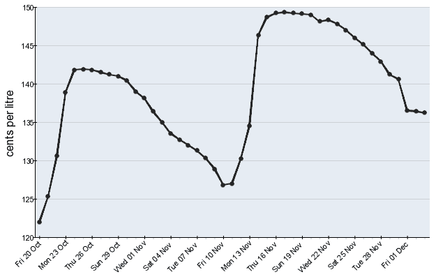
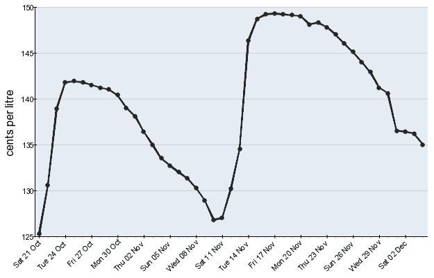
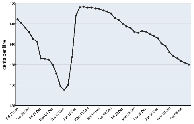
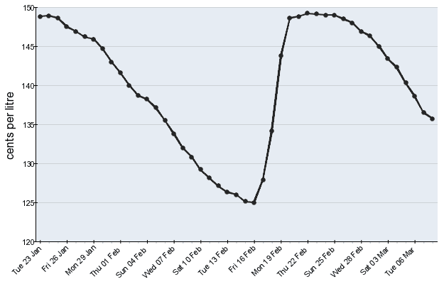
Thanks for reading! You can find the source code, and raw fuel costs
here. I also threw the data in a Google Sheet to graph it, if
you want to clone that and play around with it, you can find it
here.
This is my first attempt at doing anything related to image processing, so if you spot an error, please let me know!
Edit: A few days after publishing this, I deployed an undocumented API for this data. If you consider yourself a
power-user, have a play with it here. If you have questions
about this article, the data, or the API, please reach out.